CREATING A NOTIFICATION SOURCE OF TRUTH
I noticed Grof's app notifications were using inconsistent language across the product, and no one had a clear view of what existed. I started an audit and built a centralised repository that gave the whole team a shared language for the first time.
Context
While reviewing Grof's product, I noticed that the same user actions were being described differently depending on where you looked. A payment confirmation read one way in-app, another way in an email, and something else again in a push notification. There was no central record of what notifications existed, what they said, or who owned them.
This wasn't a problem anyone had formally raised. But the inconsistency was creating quiet friction: designers were duplicating work, engineers were implementing copy from memory or asking around, and marketing had no reliable reference when writing campaign messaging. I raised it with my PM and proposed building a repository. She mentioned she'd already been thinking they needed exactly this.
Discovery
I started by pulling every notification in the product and reviewing them against four criteria: whether they were still active, whether any were duplicating each other, whether the intent was clear (informational vs. action required), and whether the tone matched Grof's brand voice.
Across 60 notifications, several patterns emerged.
Finding 01
The same action was described in multiple ways with no clear rationale for the difference
Finding 02
Several notifications were obsolete but still active, causing confusion for users and the team
Finding 03
No team member had a complete picture of what notifications existed across the product
The Problem
Without a centralised system, each team was working from their own version of the truth. Designers referenced old Figma files. Engineers implemented from memory or Slack threads. Marketing wrote copy without knowing what the product already said. The result was a product that felt slightly off-voice in ways that were hard to pinpoint but easy to feel.
The fix wasn't just better copy. It was a system that made consistent copy the path of least resistance for everyone who needed to ship notifications.
The Process
1. Audit
Reviewed all 60 notifications against four criteria:
- Usage status: active vs. obsolete
- Redundancy: duplicate messaging across channels
- Clarity of intent: informational vs. action required
- Tone alignment: consistency with brand voice
2. Repository Design
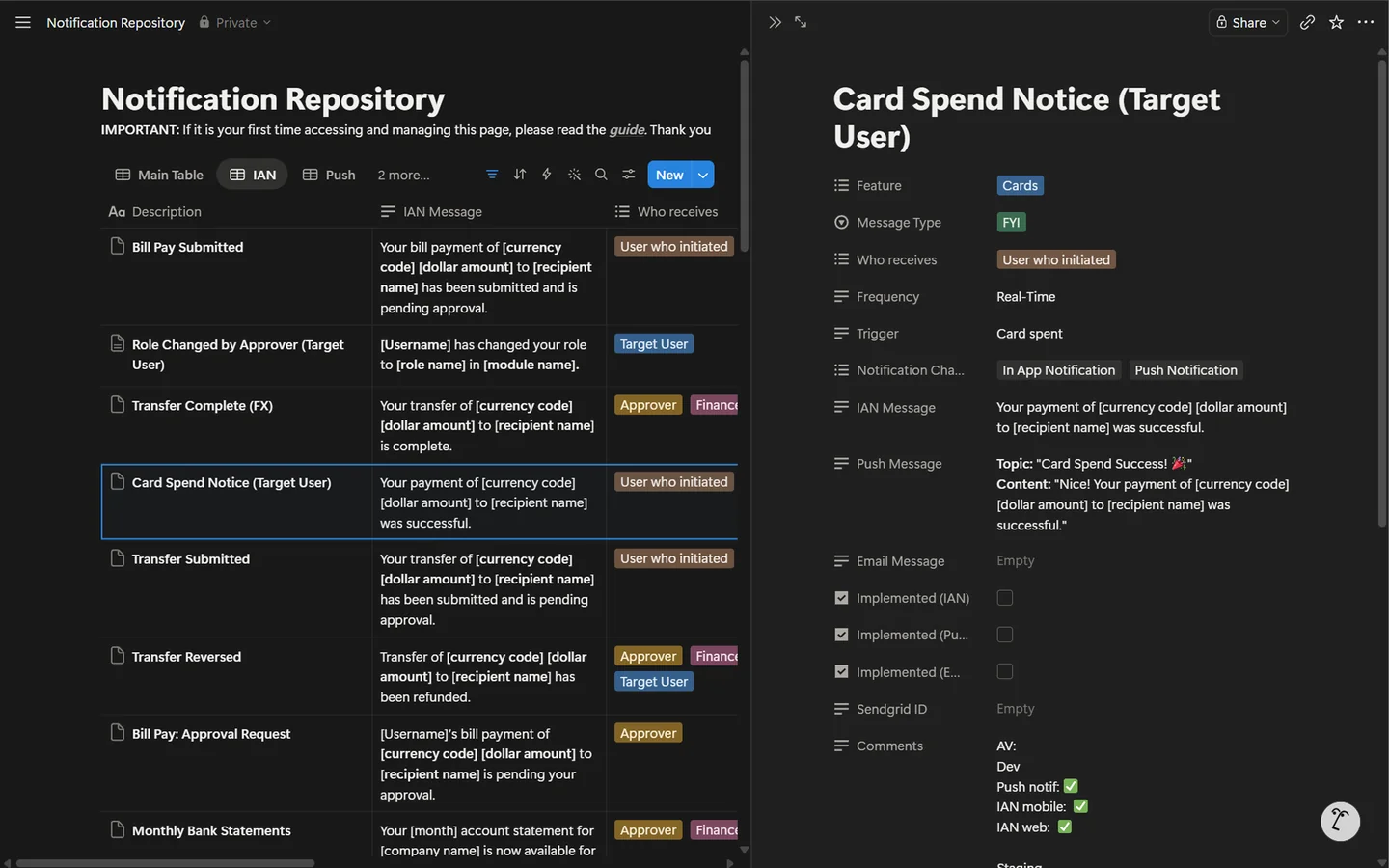
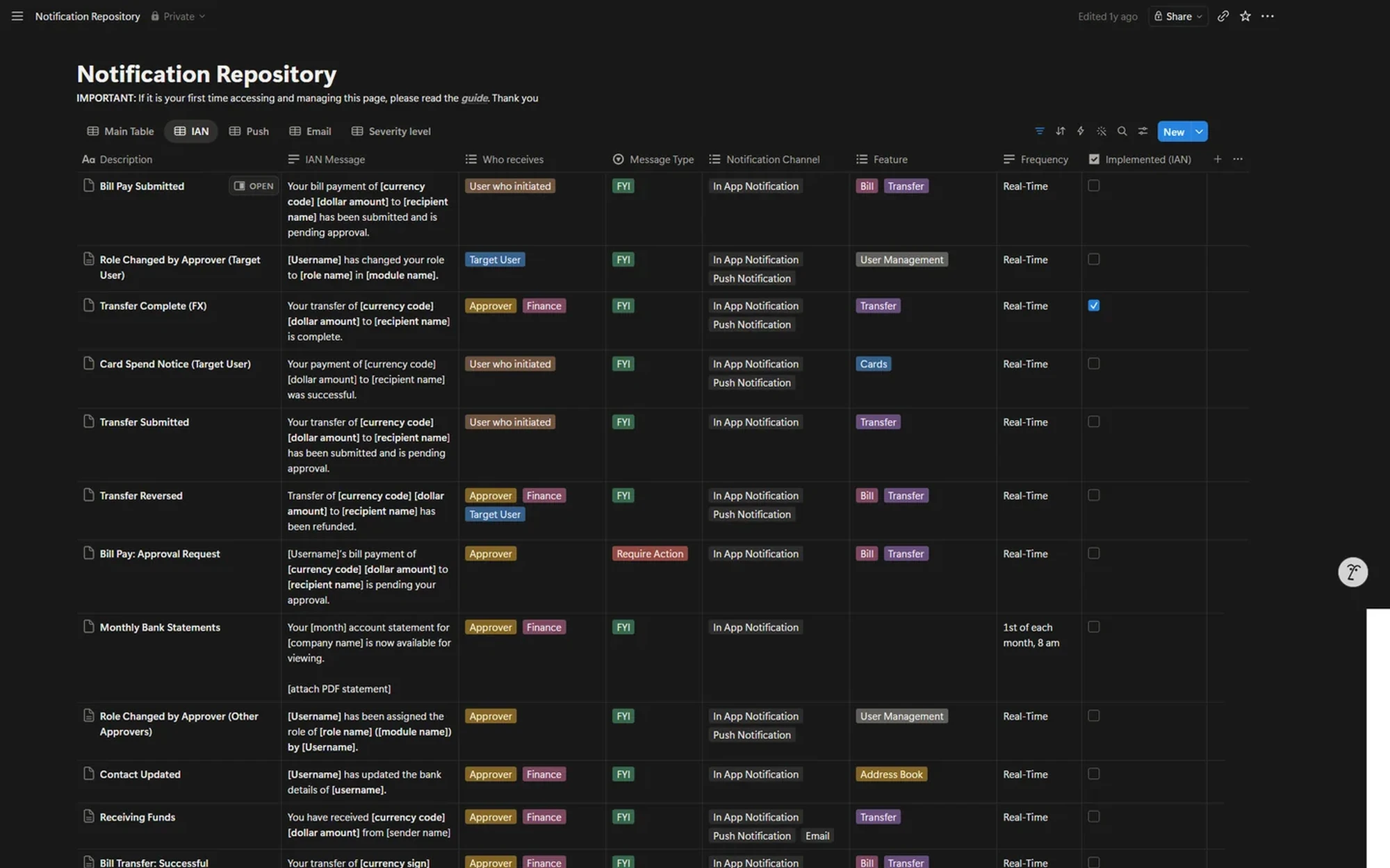
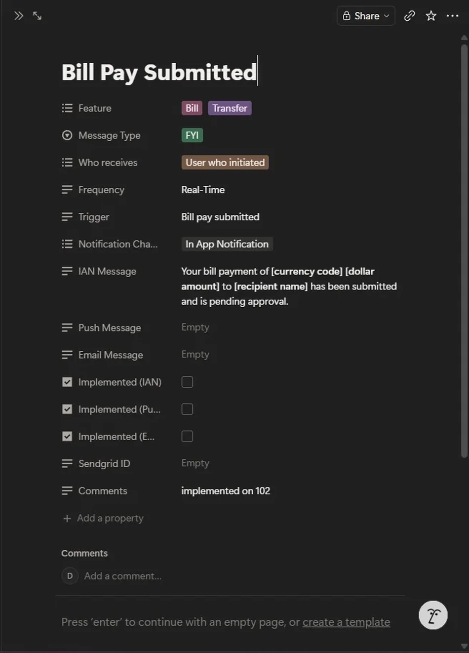
I built the repository in Notion so it was accessible to everyone without needing design tool access. Each entry covers a single notification and is structured consistently across all 60 rows:
- Notification name and description, so anyone can identify the entry at a glance (e.g. Bill Pay Submitted)
- Copy template with explicit placeholders for dynamic content, e.g.
[currency code],[dollar amount],[recipient name] - Recipient type, using color-coded tags to distinguish who receives each notification
- Feature association and notification channel (in-app, email, push), also color-coded for quick scanning
- Implementation status per channel, tracked with checkboxes so the team always knows what's live
3. Team Workflow
The system was designed to remove the designer as a bottleneck. UX and marketing draft copy, add it to the repository, and engineering implements directly from the templates. No approval loop required for standard notifications.
UX + Marketing draft copy → Add to repository → Engineering implements from templates
Key Design Decisions
Why explicit placeholders?
Engineers can know exactly which parts of a notification are dynamic vs. static, no need for guessing or waiting for clarification. A template like "Hi {user_name}, your payment of {amount} was successful" removes all ambiguity at implementation time.
Why color-coding?
With 60 notifications in one table, visual scanning matters. Color tags let anyone quickly filter by category, recipient, or status without reading every row.
Why self-service?
A system that requires a designer to approve every notification copy change isn't a system, it's a queue. Making it self-service was the only way the repository would actually get used.
Outcome
I left Grof before the repository had been in use long enough to measure adoption formally. What I did receive was verbal confirmation from both my PM and the marketing team that the system addressed a real gap and gave them a clearer, more reliable reference than anything they'd had before.
"The repository makes it so much clearer to understand what notifications we have. Before this, I'd have to dig through code or ask around." — Product Manager, Grof
The PM's reaction confirmed the core problem was real: without this, the team's default was to dig through code or ask a colleague. The repository gave them a single place to go, and the structure made it self-explanatory enough that it didn't need a handover guide.
Reflections
Design systems extend beyond UI components
A button style guide is useless if button labels are inconsistent. Content systems are as foundational as visual ones, and they tend to get built later and less rigorously. Building the notification repository felt like filling in a gap that should have existed from the start.
Word choice shapes user trust
The difference between "Payment processed" and "Payment successful" is passive vs. active voice, but it changes whether a user feels informed or uncertain. Standardising these choices at the system level means getting them right once, not re-litigating them every sprint.