REDUCING THE PAINS OF KYB ONBOARDING
Spenmo already had KYB/KYC e-forms for Singapore and Malaysia. As the product expanded into the Philippines, I adapted the form for new compliance requirements and used the opportunity to smooth out the friction points in the existing form-filling experience.
Context
Spenmo already had digital KYB/KYC e-forms running for its Singapore and Malaysia markets. As the company expanded into the Philippines, compliance requirements shifted — new document types, different verification rules, and a different regulatory baseline to design around.
Rather than simply porting the existing form over, I used the opportunity to revisit the form-filling experience itself. The SG and MY forms worked, but there were friction points worth addressing: document guidance that overwhelmed rather than helped, no prefilling despite Spenmo already holding customer data, and limited visibility for users returning to a partially completed submission.
Discovery
I started by reviewing the existing SG and MY e-forms end-to-end, mapping where users were most likely to slow down or drop off. I also benchmarked how other products handled compliance document collection: DocuSign's guided workflows, Stripe Identity's progressive document steps, and government e-form patterns used across Southeast Asia.
Three friction points in the existing experience stood out as worth solving for the PH form.
Insight 01
Document guidance dumps too many options at once, making it harder, not easier, to choose
Insight 02
Known customer data wasn't being used to reduce form effort, despite it being available
Insight 03
Returning users had no quick way to see what was submitted vs. still pending across 12 document fields
The Problem
The existing forms were functional, but the experience of filling them out put most of the burden on the user. Document guidance presented every acceptable option upfront, regardless of what a typical SME owner would actually have. Fields that could have been prefilled weren't. And once a user submitted some documents and came back later, there was no clear way to see their progress at a glance.
The PH expansion was the right moment to address these. Adapting the form for new compliance requirements meant touching it anyway, so the question became: what can we improve while we're here?
Design Principles
1. Reduce cognitive load through progressive disclosure
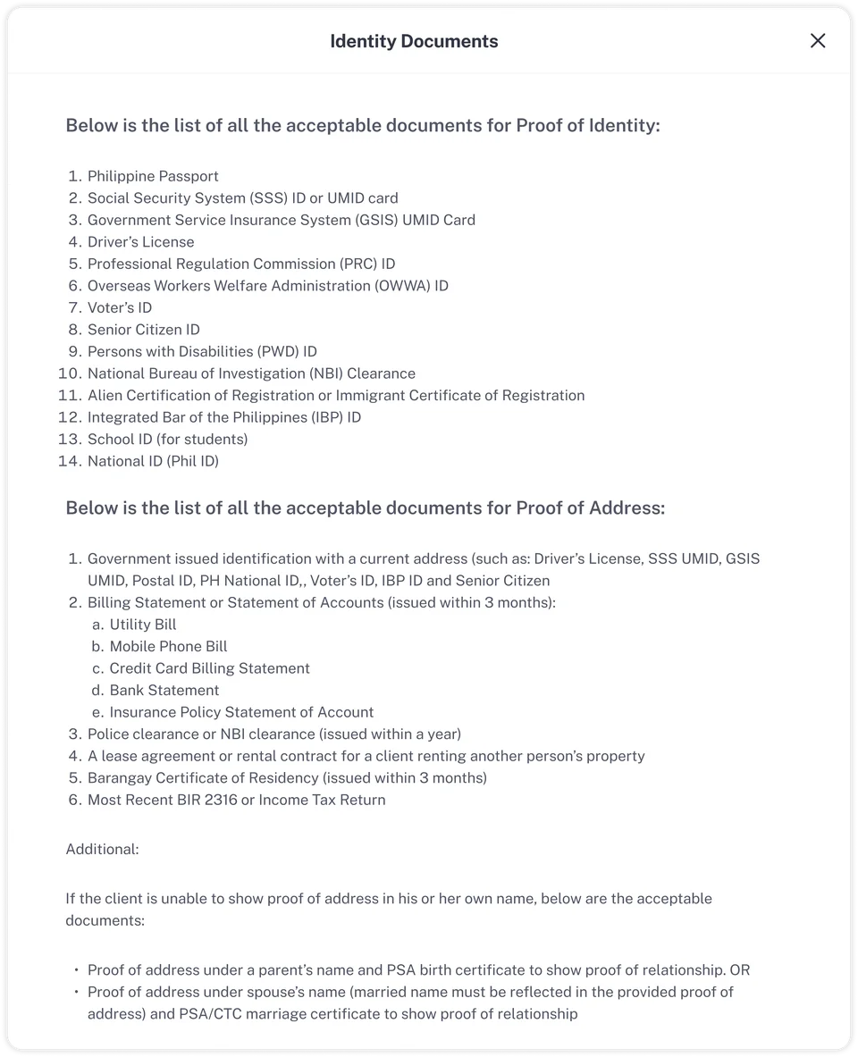
One of the most friction-heavy moments in the original form was the document selection step. When a user needed to provide proof of identity, the form presented the full list of acceptable documents, often 10 or more options in one block of text. Instead of helping users decide, it overwhelmed them.
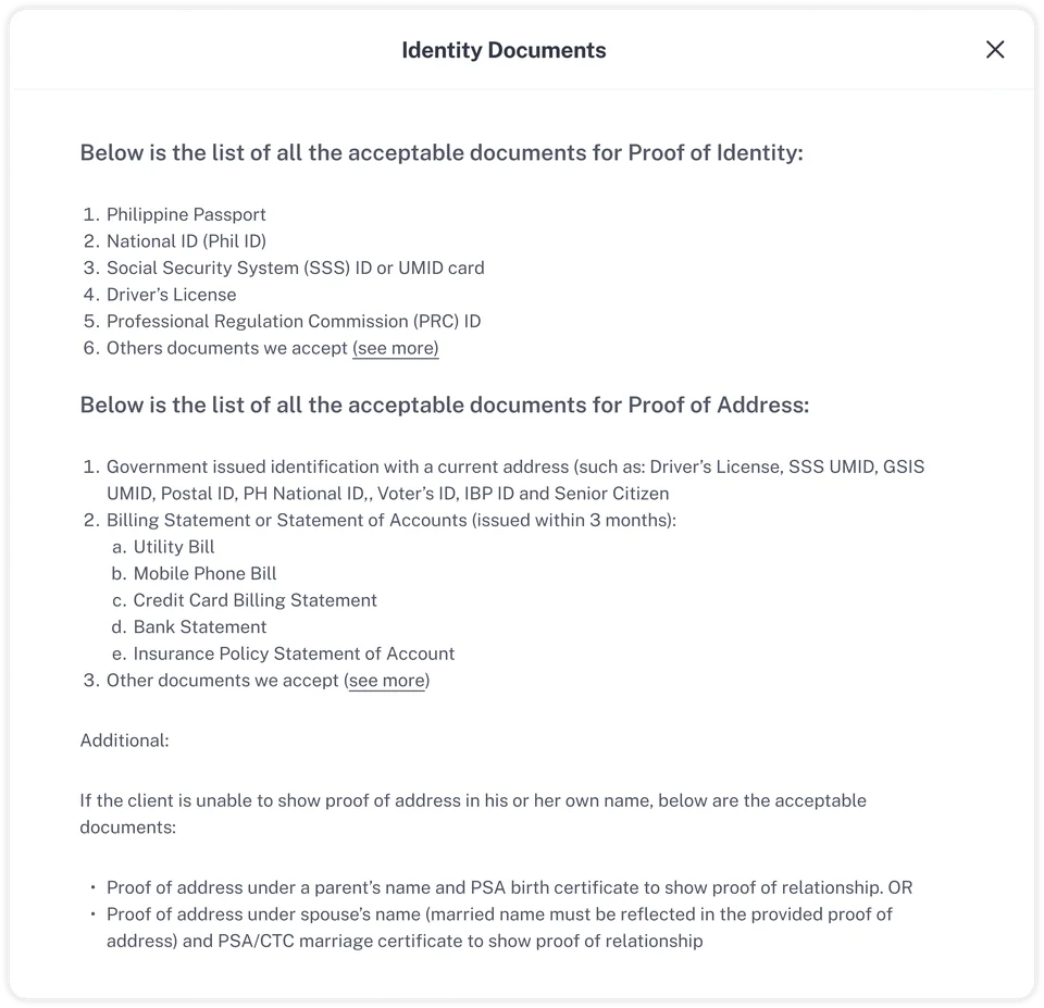
I restructured this by surfacing a prioritised list of the documents most SME owners are likely to already have. For users who don't have those specific documents, a "See more" link reveals the full set of alternatives. This kept the default experience clean while preserving flexibility for edge cases.
Before
After
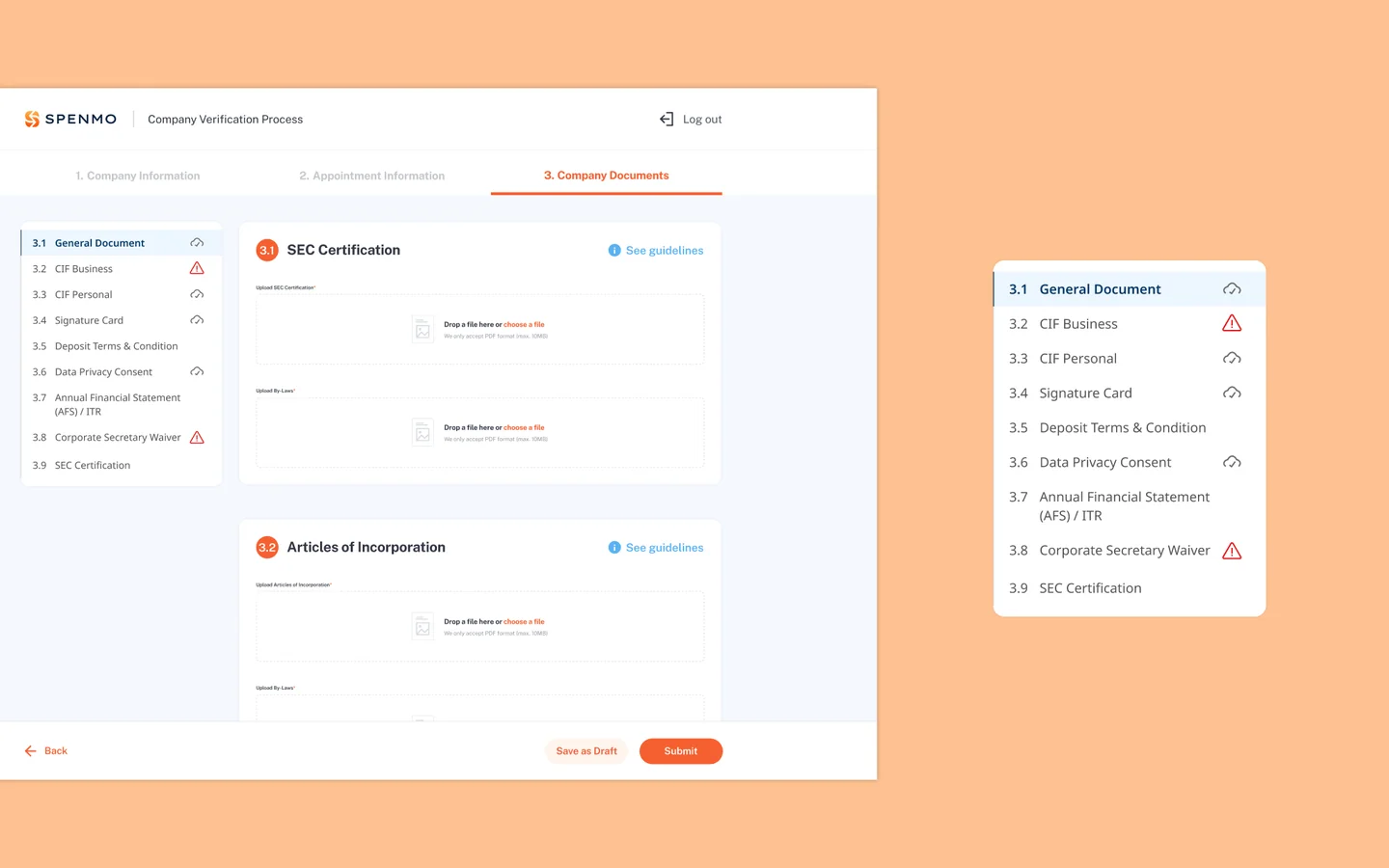
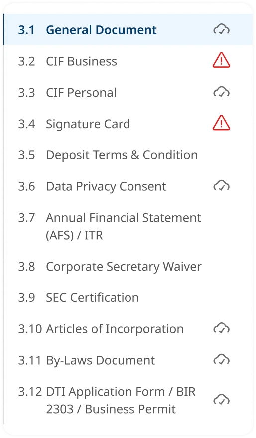
2. Make progress impossible to miss
A sticky side navigation anchors to the screen as users scroll through the 12-document flow. Each item shows one of three states: incomplete (empty), complete (✓), or needs attention (⚠). Returning users can see exactly where they left off and jump directly to it, with no scrolling required to find their place.
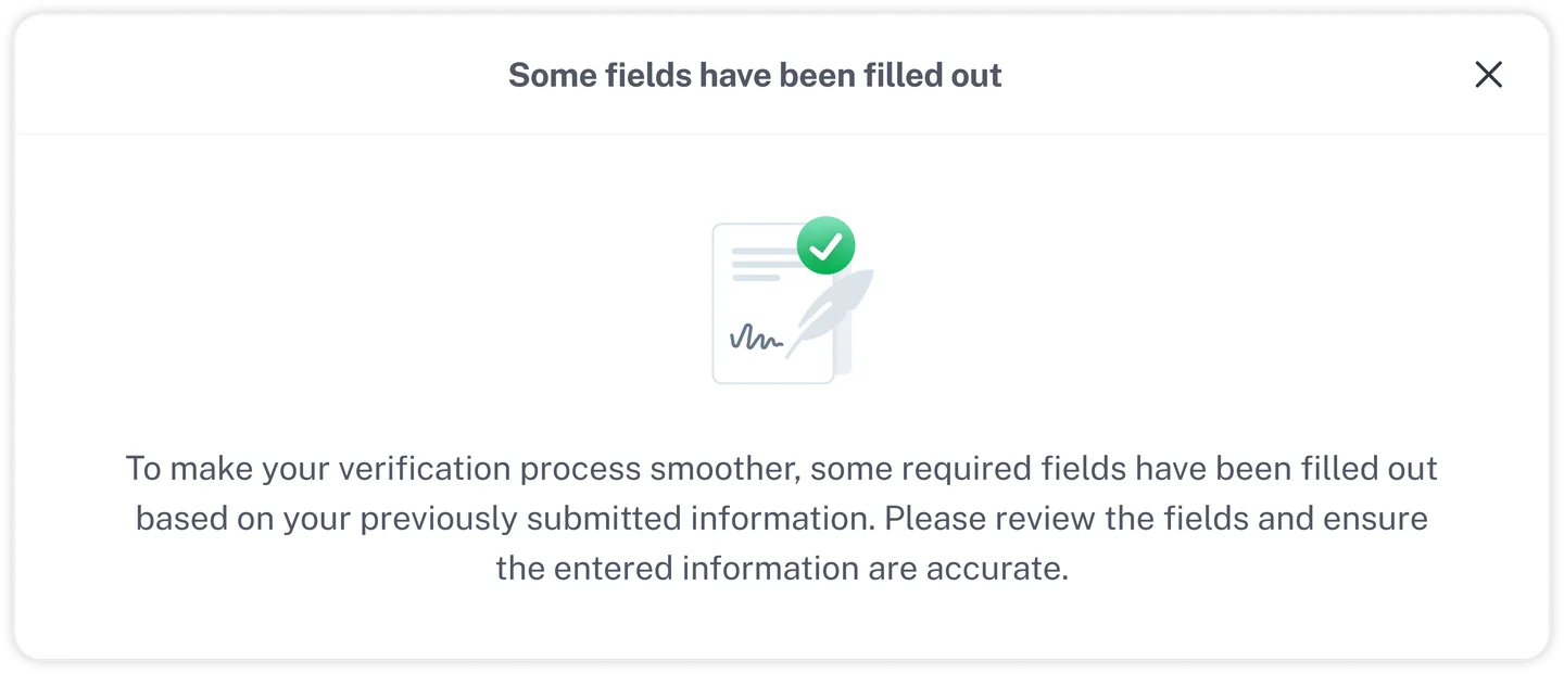
3. Prefilling as a feature, not an afterthought
The previous form had no prefilling at all. Users were expected to re-enter details that Spenmo already had from the sales process: their name, company registration, contact information. I introduced prefilling as a deliberate feature, pulling in that data automatically so users arrive at a form that's already partially complete.
To make sure users didn't feel like information had been changed without their knowledge, I added an explicit notification on entry: a clear message explaining that some fields had been pre-filled based on previously submitted information, and prompting them to review and confirm. This gave users a sense of support rather than surprise.
Cross-Functional Work
I worked closely with the compliance team to shape the content side of the form. They helped define what guidance we could legitimately provide inside the tooltips and document help sections, so users got clear, accurate explanations of what each document was for and what alternatives were acceptable.
With engineering, I ran feasibility checks on the two most technically involved parts of the design: the prefilling system and the sticky side navigation component. I also worked through how different business types would affect which form fields appeared, to make sure the conditional logic was implementable without creating edge cases down the line.
Reflections
Regulatory constraints push better structure
The constraint of needing to collect 12 document types forced me to ask the right question: how do we make this manageable? The answer wasn't prettier buttons but structural changes. Progressive disclosure, persistent navigation, and status tracking turned a compliance checklist into a guided experience.
Transparency is part of the design
Adding the prefill notification was a small decision but has a big impact on how the form felt. Through minor transparency measures, users know why something has happened, which allows them to trust the system more.